Coding Basics II
Lesson 3
Media Queries
Note: If you would like to see an example of responsive coding in work, minimize the page you will notice the content on the page shifts to match and the headers change color!
Prerequisites
A basic knowledge of device width, as well as a basic knowledge of CSS and HTML. Also, a will to learn and the patience to do so.
Objective
To gain a basic understanding up media queries and the CSS styles that are used to make the queries happen.
What are Media Queries
Now you may be wondering to yourself what is a media query and what can it do for me. Well to answer that questions media querys allow you to make a site responsive and shift to the size of the browser. Now to do this you must think it takes hours upon hours of code. Well your wrong alls it requires is a second style sheet with this line of code at the end: media="only screen and (max-width: 920px), this line of code: @media screen and (min-width: 300px) and (-webkit-min-device-pixel-ratio: 2) {, Patientce, Practice, and a basic knowledge of css.
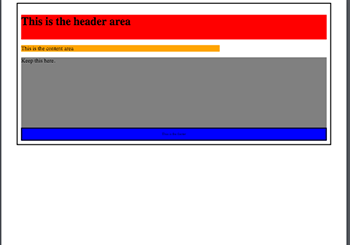
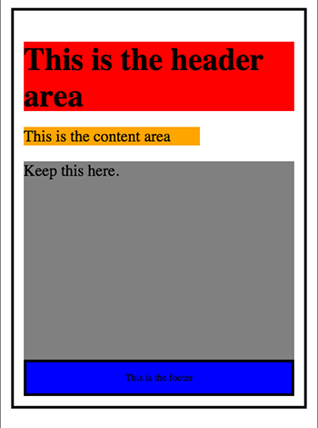
Now with the new css stylesheet set up you will begin to take your styles that you have setup for your base site and modify them slightly to fit into the responsive side of the site. Under this will be two images of my regular CSS and then my narrow CSS so you can gan an idea of the differences. Note: Images will not appear if the screen width isn't large enough.
Viewport
The <meta name="viewport" content="width=device-width, initial-scale=1.0"> allows the site to adjust to the screen it's on. Below is an example of with and without the viewport.
With and Without Viewport
Without
With
Media Query Related CSS
These are the base css styles needed to set up a responsive website.
min-width
Min-width in CSS is a property used to set the minimum width of the effected element and prevents the width from being less then the specified amount.
Example min-width:20px;
max-width
Max-width in CSS is a property used to set the max width of the effected element and prevents the width from being more then the specified amount.
Example max-width:20px;
min-device-width
Min-device-width is a media query property that is used to specify the min width of the device such as a computer or a phone screen
Example min-device-width:20px;
max-device-width
Max-device-width is a media query property that is used to specify the max width of the device such as a computer or a phone screen
Example max-device-width:20px;
min-height
Min-height in CSS is a property used to set the minimum height of the effected element and prevents the height from being less then the specified amount.
Example min-height:20px;
max-height
Max-height in CSS is a property used to set the max height of the effected element and prevents the height from being more then the specified amount.
Example max-width:20px;
min-device-height
Min-device-height is a media query property that is used to specify the min height of the device such as a computer or a phone screen
Example min-device-height:20px;
max-device-height
Max-device-height is a media query property that is used to specify the max height of the device such as a computer or a phone screen
Example max-device-height:20px;
Example
Note: If you would like to see an example of responsive coding in work, minimize the page you will notice the content on the page shifts to match and the headers change color!.
Test Your Knowledge Here!